This article will break down the different aspects of your GoLinks personal analytics page. This will show your GoLinks usage among other interesting analytics. You can navigate to your personal analytics by clicking the Analytics tab on the left hand column of your workspace. This will take you directly to your personal analytics and allows easy navigation to other analytics segments.
Your Time Saved
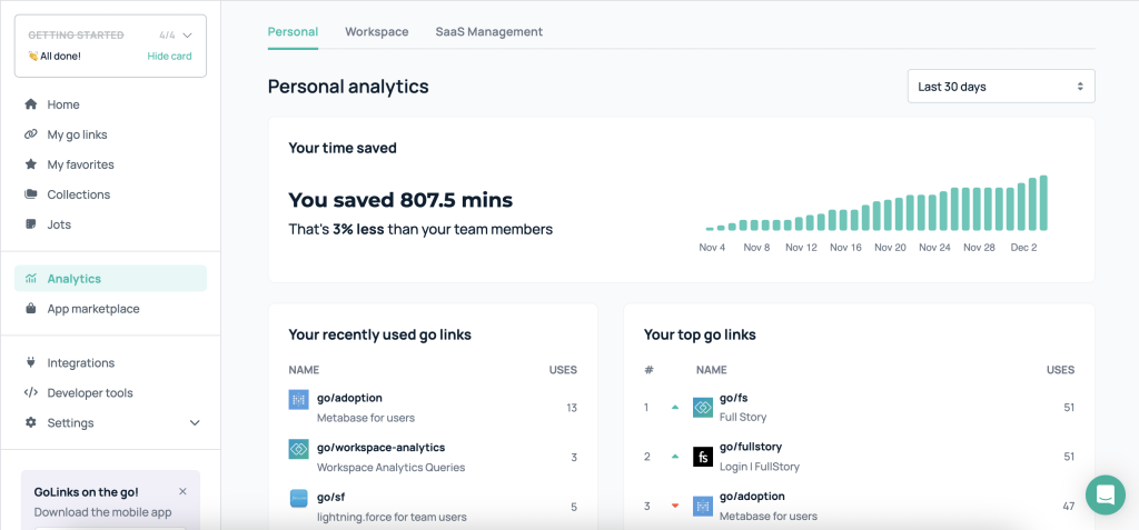
This savings graph visually displays the time savings generated by your custom go links compared to searches across your workspace. Select preset time ranges to view savings over the past day, week, month, quarter or all-time. Hover over any data point to see the specific minutes saved at that point. This graph allows you to easily track the impact of your go links over time.
Your Used GoLinks
Your go links usage is analyzed in two separate segments. The left segment displays your recent go links usage while the right segment shows your top go links usage. The default view for these segments show the last 30 days, but you can adjust the time range similarly to the time savings chart. To view additional go links and details click View more at the bottom of your list. Together, these two usage segments provide an analysis of your overall go link usage patterns.
GoLinks Creation and Usage Graphs
The bottom of the page has three graphs for go link creation rate, individual go link usage, and applications used. Each graph can be expanded to show more details and change the date range, similar to the above sections.
This provides visibility into:
- How rapidly you are creating new go links
- Usage of individual custom go links
- Top apps your links point to
These graphs enable tracking go link creation rate, usage, and destination app patterns over customizable time periods.
This feature is available on our pro and enterprise accounts.


